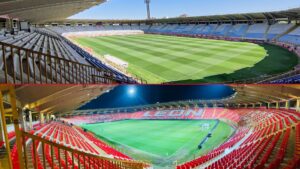
The grandstand is the “background” of the venue: you see it in every photo, in every video and at every event.
That is why, when a stadium or pavilion needs an image leap, the stands are usually the most visible and efficient lever. The difference between a “correct” venue and one that conveys level is often not in the structure, but in how it is visually arranged: colorimetry (palette + contrast + distribution) and, if an iconic impact is sought, a grandstand mosaic that represents a club or a city.
The “before”: signs of a tier that lowers perception
In many facilities, the problem is not a lack of seating, but a lack of visual criteria and coherence. This is what usually happens before a well-planned renovation: mix of tones or mismatched replacements that break the uniformity, lack of contrast (everything looks “flat” or dull), sectors without clear visual reading, unflattering background for photos, presentations and sponsorships, feeling of age even though the facility is operational, maintenance that is noticeable (accumulated dirt, visible deteriorated parts, inconsistent numbering).
Result: the enclosure is perceived as “lower” than it really is.
The “after”: what changes when you apply colorimetry with intent
Colorimetry applied to bleachers is not “putting pretty colors”. It is a system to order the space and build identity.
When done well, this happens: the venue gains coherence and is perceived as more modern, the stands are better “read” from afar (and on camera), the identity of the club or the city is instantly understood, the sectors are visually distinguishable (better orientation of the public), the background improves for communication and sponsorship, the “patch” effect is reduced in replacements because there is a defined color plan and replacement stock.
Mosaic in bleachers: when the bleachers become a trademark
The mosaic (pixel art type) turns the grandstand into an identity asset: club or city name, year, motto, symbol, stylized crest or a recognizable pattern. Well executed, it is not decoration; it is a positioning tool.
It has an impact on: perception of level (it looks like a well-kept venue), memorability (the place is recognized without reading signs), content (photos, networks, press and corporate pieces with a powerful background), value for sponsors (more “televised” and professional image), fan experience (feeling of belonging and visual identity).
Keys to make a mosaic really work (and not get lost from a distance)
A mosaic should be designed to be viewed at the actual distance from the grandstand and, if applicable, for camera.
These keys avoid typical mistakes: high contrast between figure and background (if not, it “eats” the design), thick strokes and simple shapes (fine details are lost), avoid too many colors (better 2-3 tones + neutral), test legibility with a render from real viewpoints, fit the design with sectors and corridors (the mosaic must “survive” the cuts), plan repositioning (if a piece is broken, it must be able to be replaced without affecting the drawing).
How to design a colorimetry and mosaic project in 6 steps
1) Identity brief and objectives
Define what you want to convey: club, city, anniversary, message, sober or more emotional style, TV/network priority or on-site experience.
2) Palette and color system
Select main, secondary and neutral colors; decide proportions and where each tone will go in each sector.
3) Mosaic design
Create a readable design, with clear contrasts and “big” shapes. Quick test: if it’s understood in 2 seconds, it’s good.
4) Sector, row and seat mapping
Converts the design into a matrix (sector/row/seat) to calculate quantities per color and reduce assembly errors.
5) Technical and maintenance plan
Choose solutions that withstand outdoor, intensive use and cleaning; define minimum replacement stock per color and per critical area.
6) Logistics and installation
Prepare packaging and deliveries by sector/row. The clearer the plan, the faster and safer the installation will be.
Quick checklist before approving a grandstand mosaic
- Definitive plan of sectors, rows, aisles and numbering
- Closed palette with remotely validated contrast
- Design tested from actual viewing points (opposite tier, side, camera)
- Quantities per color + defined replacement margin
- Replenishment plan to keep the mosaic consistent over time
- Packaging by sectors and installation guide to avoid errors
- Review of enclosure requirements: exterior/interior, heavy use, cleanliness, vandalism, and applicable regulations.
Common mistakes (and how to avoid them)
- Designing with too many details: simplify and gain contrast
- Don’t think about aisle cuts: integrate the design with the actual geometry
- Do not plan replenishment: define “stock” colors and a minimum of spare parts
- Choosing a palette without a camera test: check reference photos and simulations
- Make “aesthetics only” without operation: integrates sectors, numbering and orientation
What type of enclosures does it work best for?
- Soccer stadiums (identity, TV, sponsorship, fans)
- Municipal sports centers (visible renovation without structural work)
- Pavilions and auditoriums (visual coherence and experience)
- Padel/golf clubs with bleachers (premium image and visual order at events)
If you want a realistic before/after before you invest, we make it easy
Send us a photo of the grandstand and the floor plan (or approximate measurements per sector) and we will send you back a colorimetry proposal + a mosaic sketch designed to look good from a distance and on camera. Your venue does not need “more renovation”. It needs a grandstand that is instantly recognizable.


